Conceiving the Emblem
A corporate logo is more than a visual trademark; it is a declaration of identity, a visual reflection of philosophy, and a promise. When the Srimukha logo was conceived, it was designed to mirror the very products we manufacture—precision gears, rotating shafts, and transmission systems.
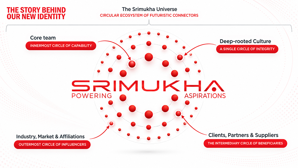
The logo represents The Srimukha Universe: a circular ecosystem of futuristic connectors. It captures the rhythm of rotational symmetry and precision alignment, demonstrating that our organization is built of concentric circles of value that work in perfect harmony. The distinctive dot in the “A” of “SRIMUKHA” is inspired by the traditional Hindu Sindoor (Kumkum), symbolising auspiciousness, identity, and cultural heritage. It reflects the values and traditions that are an integral part of the Srimukha identity.
Decoding the Geometry
The visual breakdown of the Srimukha Universe reveals how the four concentric circles interact, creating a balance of internal capability and external influence:
Symbolic Typography
Beneath the concentric ecosystem lies the Srimukha brand name, accompanied by the tagline Powering Aspirations. The structured geometric typography reflects the precision and engineering discipline at the heart of Srimukha. The distinctive dot beneath the ‘A’ in SRIMUKHA, inspired by traditional Kumkum, symbolises auspiciousness and identity, while reinforcing our deep-rooted culture of integrity, ethics, trust and responsibility.
Powering Aspirations reflects our larger purpose: beyond manufacturing precision shafts, worms, gears and transmission components, we engineer critical components for automotive powertrain, drivetrain and the evolving EV mobility space, while powering the growth and aspirations of our customers, partners and 1,200+ employees and their families.